Hideki
A New Era of Yakitori
CLIENT
Hideki
LOCATION
Brisbane, Australia
DELIVERY
December 2024
Logo Design / Branding & Collaterals Design / Graphic Guidelines / Brand Voice & Storytelling / Website Design & Development
The team of Hideki looked to redefine Brisbane’s dining scene with a contemporary Japanese Yakitori Bar, that blends casual fine dining with a minimalist elegance. The name ‘Hideki’ itself, which means strength and excellence in Japanese, reflects the team’s commitment to providing an unparalleled dining experience.
With two distinct locations — the intimate, moody Burnett Lane venue and the bright, al fresco venue at James Street — Hideki needed a visual identity and brand story that reflected the duality of their spaces, inspired by Japanese artistry and culture, while creating a cohesive yet adaptable brand experience.
Solution
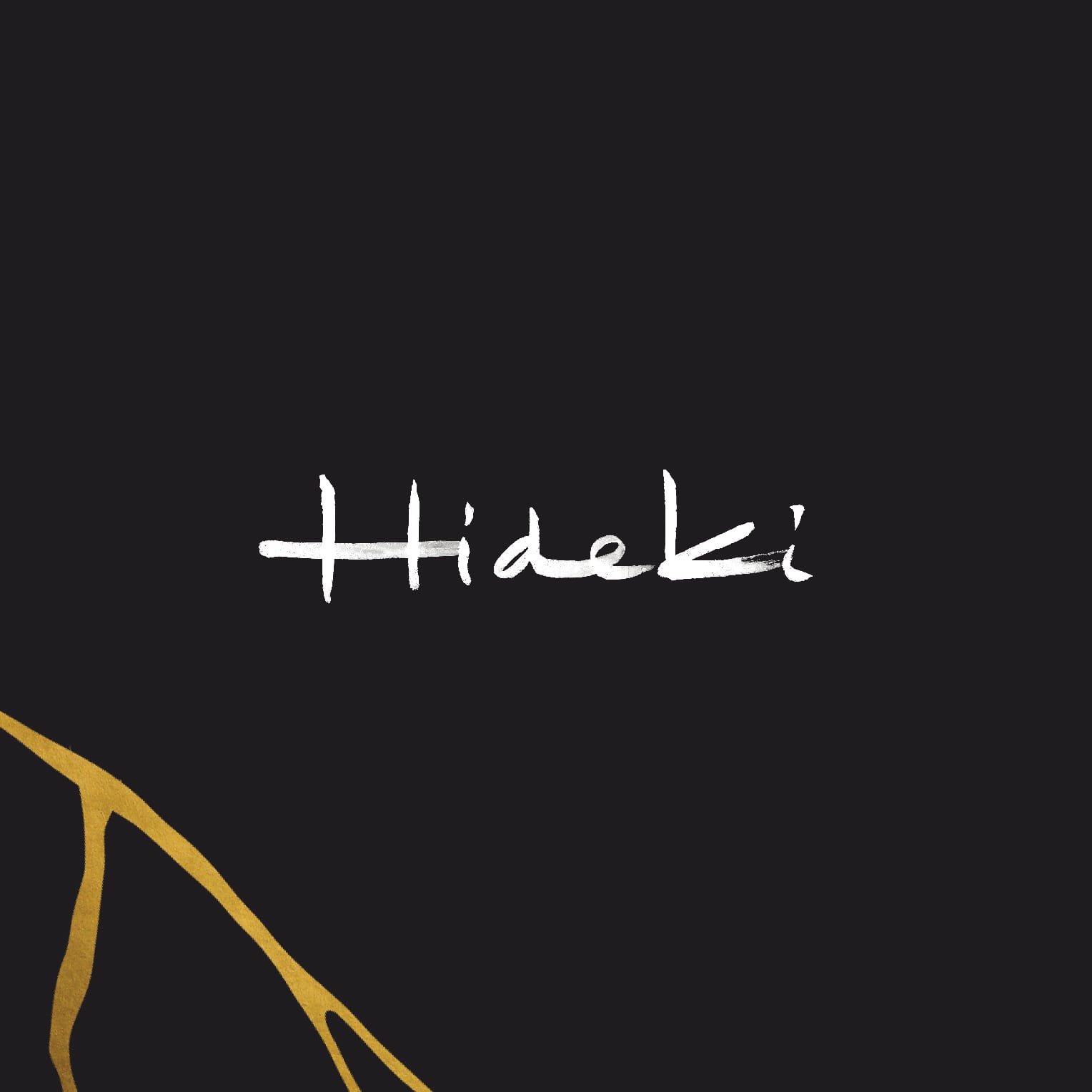
Logo Design: The hand-drawn logo captures the fluid movement of Japanese brush strokes, embodying Hideki’s precision, artistry, and commitment to craftsmanship.
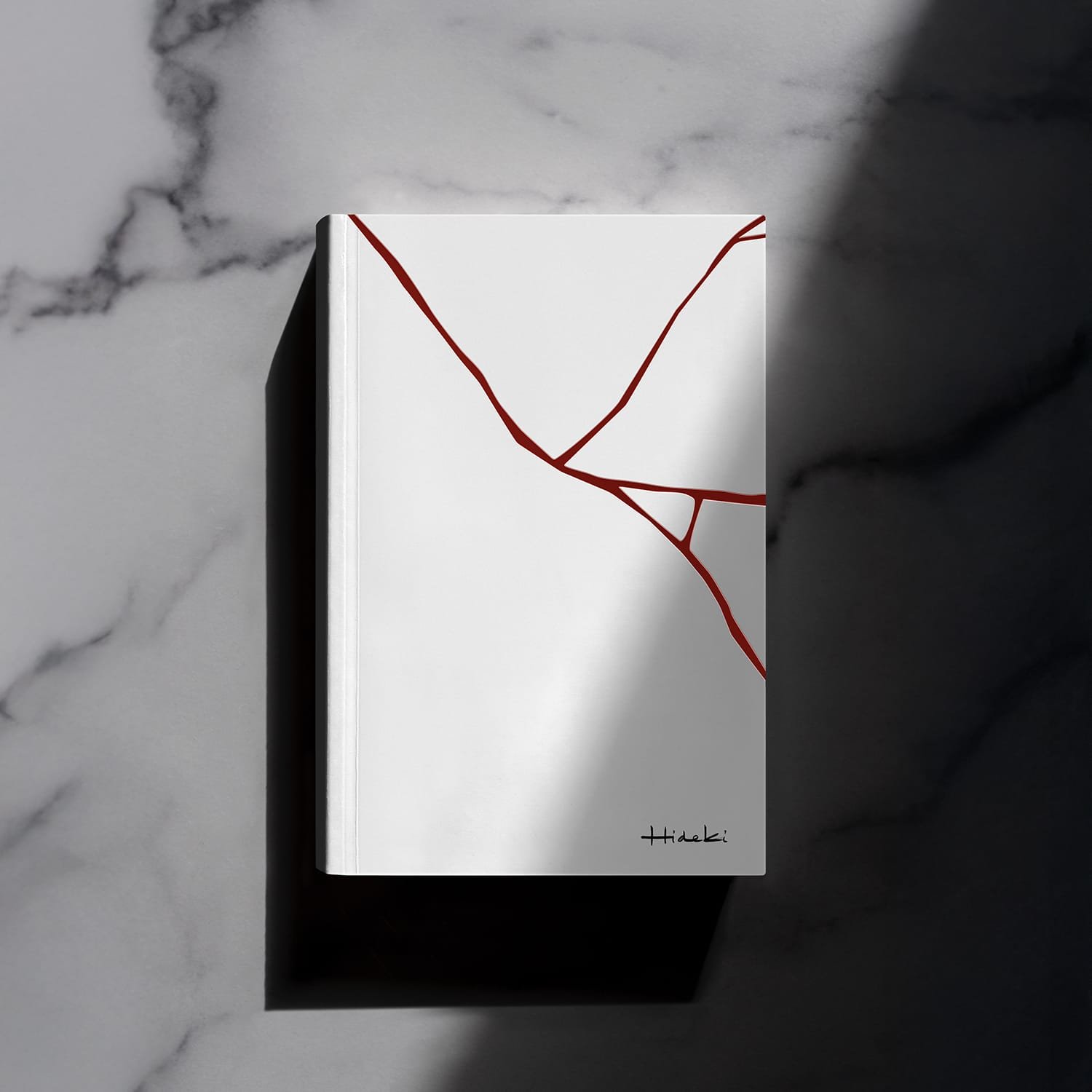
Branding: A minimalist approach was taken to reflect the venue’s bold yet elegant design. Inspired by the Japanese philosophies of Kintsugi (gold repair) and Shibari (artful binding), a ‘reversible branding’ approach was taken. Throughout the branding the kinsugi effect was used, whilst distinct colour palettes was introduced for each venue whilst ensuring seamless adaptability of the brand.
- Burnett Lane: black with gold tones to complement the venue’s use of materials such as black stone, Japanese ceramic tiles, rendered brick, and brass.
- James Street: A lighter, al fresco ambiance so the use of white with red accents was selected to seamlessly blend with the greenery and open-air energy.
Brand Voice & Storytelling: the narrative was rooted in excellence, opportunity, and discovery — the essence of Hideki. The tone of voice is sophisticated yet modern with an approachable elegance that reflects the restaurant’s ability to bring together intricate Japanese traditions with a contemporary dining experience.
Website Design & Development: The website mirrors Hideki’s minimalistic elegance with clean layouts, seamless navigation, and a refined aesthetic. The storytelling emphasises Hideki’s artistry and dual venues.
Strategy
Our focus was to create a brand that:
- Reflects the duality of Hideki’s venues while maintaining a cohesive identity.
- Balances bold minimalism with cultural elegance inspired by Japanese artistry.
- Establishes a digital presence that teases the experience and invites discovery.
Outcome
The branding of Hideki aimed to marry the depth of tradition with the freshness of contemporary innovation to deliver a bold yet refined visual identity that adapts effortlessly across both locations. From the hand-drawn logo to the dual palette and storytelling, every element reflects Hideki’s core philosophy: to encapsulate the soulful, meticulous preparation and the communal joy of Japanese dining.

Materials featured on this page are shown courtesy of Hideki and/or have been created by YouMakeMe