Sequoia Nova
Building a Brand for a New Kind of Learning
Naming, Naming Architecture, Logotype design, Branding Strategy & Positioning, Markeitng consulting, Art direction, Storytelling, Voice Definition, Visual Identity, Website Development, Collaterlas Design, graphic Guidelines
Sequoia Nova is a forward-thinking international primary school based in Bangkok. Designed around bilingual learning and a project-based approach, the school challenges conventional education models and places curiosity, creativity, and global awareness at the centre of the student journey.
The founders approached us ahead of the school’s launch with a clear objective: to create a complete brand world that would reflect their educational vision and set them apart in a competitive market. The brief covered every facet of the brand, from naming architecture and positioning to the development of a scalable identity system and full suite of brand collaterals.

Strategy
Our work began with defining a brand positioning that could grow with the school. Sequoia Nova needed to feel joyful, intelligent, and modern, while remaining rooted in educational excellence. The name itself, inspired by one of the world’s tallest trees and a word meaning new, was chosen to evoke both strength and possibility.
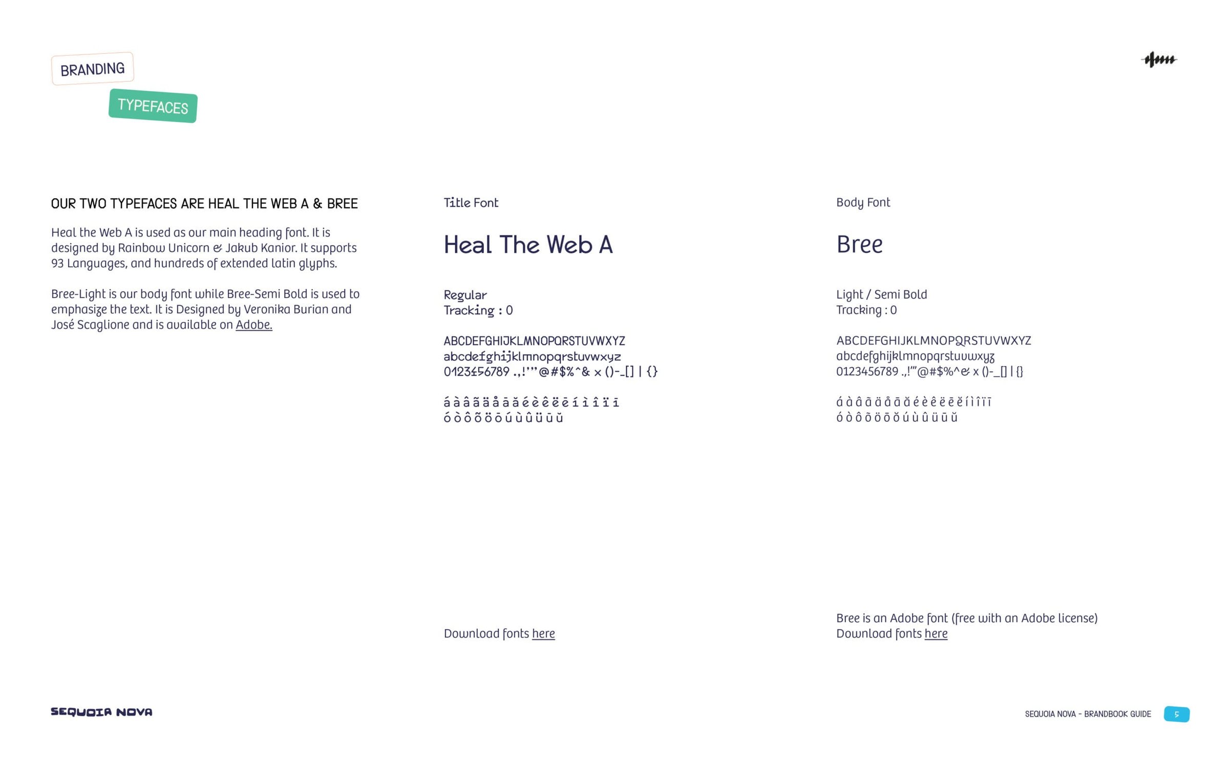
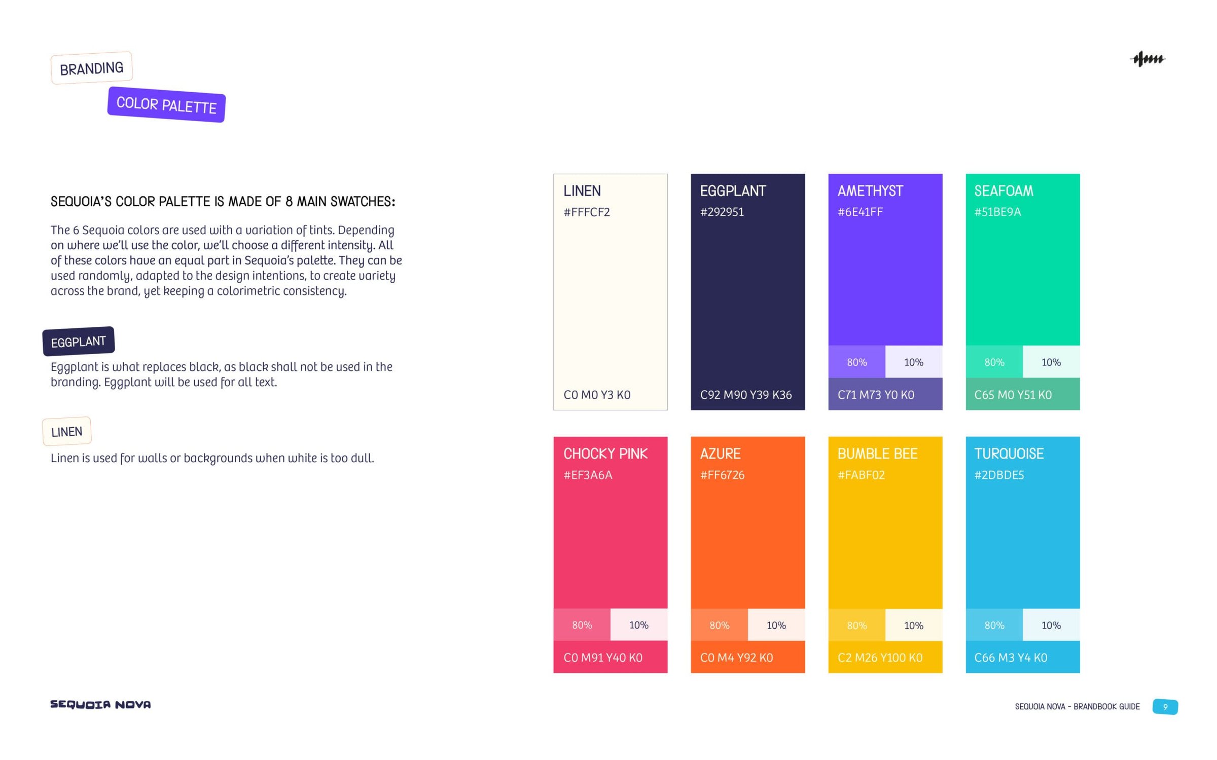
The brand identity brought this vision to life through a vibrant and flexible visual system. The logotype was paired with a dynamic colour palette and supported by distinctive typography. The design language was intentionally bold, confident, and full of energy, while still feeling structured and intentional.

Outcome
Sequoia Nova launched with a brand that feels distinct, scalable, and emotionally resonant. The identity reflects the school’s mission to empower a new generation of learners and gives the team a robust framework for future growth.
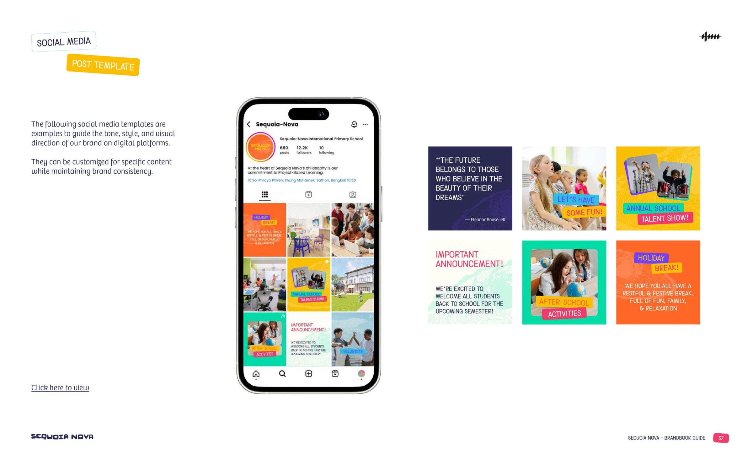
From website to classroom signage, every touchpoint communicates the school’s spirit with clarity, warmth, and purpose.


