
Mango Tree
A new chapter for Mango Tree: celebrating “Sanuk”, the joyful spirit of Thai living.
CLIENT
Mango Tree
LOCATION
Bangkok, Thailand
DELIVERY
2025
Brand Strategy / Logo Redesign / Brand Identity System / Tone of Voice Development / Collateral Design / Photography & Art Direction / Storytelling / Social Media Voice Guidelines / Creative Direction / Brand Roll Out
Mango Tree, one of Thailand’s most established restaurant groups with a global presence, partnered with YouMakeMe to redefine its brand for a new generation. With more than 46 locations worldwide, Mango Tree wanted to move beyond the dated image of a traditional Thai heritage brand and evolve into one that feels fresh, expressive, and globally relevant while remaining deeply rooted in Thai culture.
We helped Mango Tree rebrand their Flagship “Thai Dining” brand as well as Mango Tree Café, a more soulful and casual brand.
Strategy
The foundation of the rebranding revolves around the concept of the “Sanuk”, an array of Thai folkore references, that are inherently and playfully Thai, yet relatable by international audiences.
Willingly staying away from the clichés, we celebrate everyday joy and wit, and recreate all these “oh-so-thai” experiences any traveller notices about Thai culture.
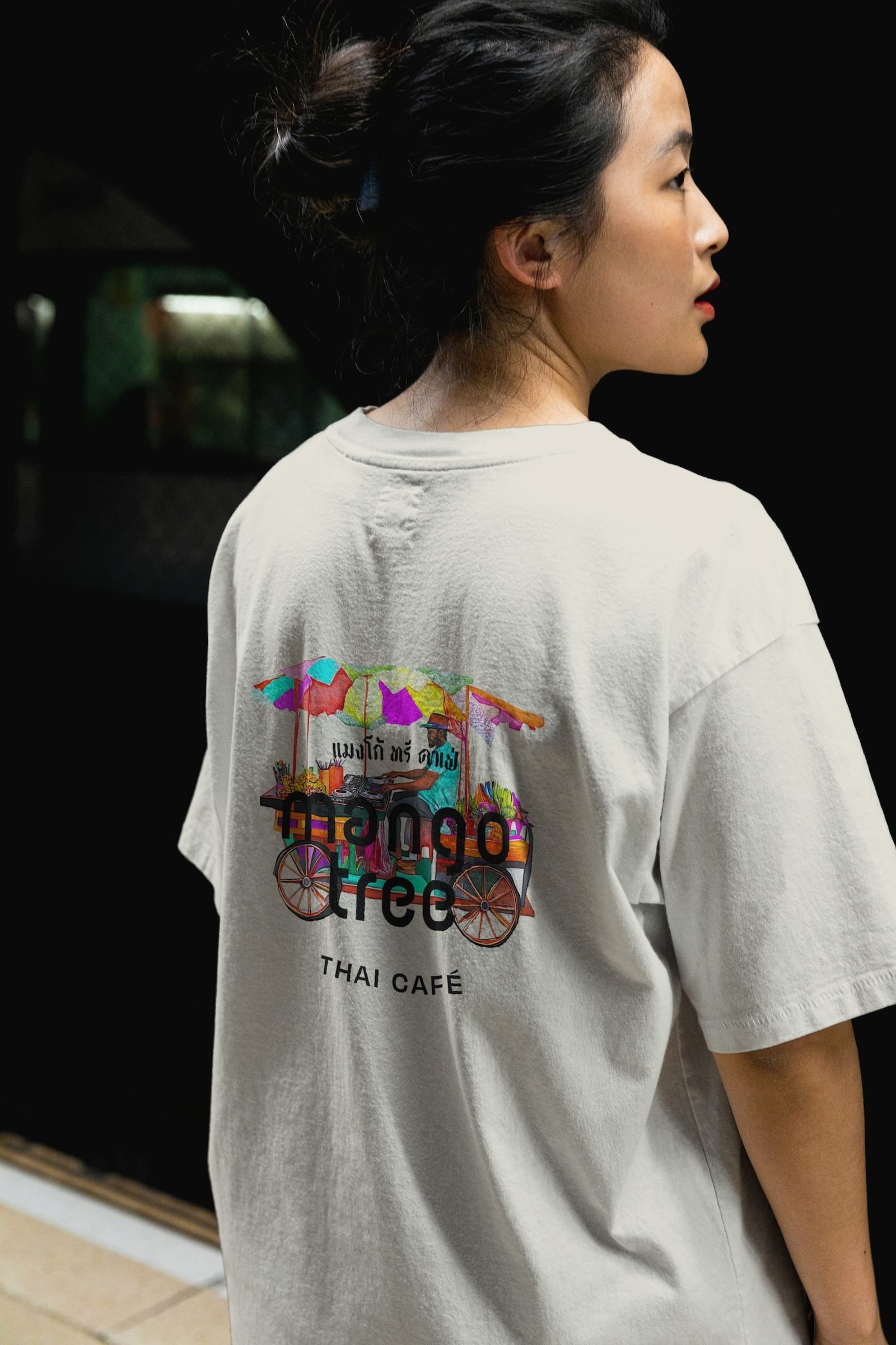
Mango Tree Café
Mango Tree Café is the approachable and casual outlet of Mango Tree.
Its refreshed logo system was designed to complement the flagship while introducing a more vibrant, dynamic expression through bold typography and lively colour contrasts.
The overall look is cheerful and inviting, reflecting the café’s position as a friendly, family-oriented space for both locals and travellers.
The tone of voice positions the café as that easy-going Thai foodie friend that is warm, inclusive, and full of personality. Across menus, packaging, and social media, the new voice brings the brand’s energy to life through simple, flavour-forward language and a spirit of genuine hospitality.


Mango Tree Restaurant
Mango Tree’s flagship rebrand aimed to elevate its position as a leader in refined Thai dining while preserving its sense of authenticity and warmth. The concept of Discreetly Sanuk inspired an identity that is elegant, minimal, and modern, yet undeniably Thai.
The visual language draws from premium materials and tactile finishes such as foil printing and textured paper, paired with a sophisticated colour palette of orange and mango-leaf green. The logo, refreshed after 25 years, brings new clarity and confidence to a well-loved symbol.
The tone of voice, defined as Refined Thai Dining Reimagined with Joy, captures the restaurant’s quiet confidence and contemporary character. Every detail, from menu design to storytelling, reflects a modern interpretation of Thai hospitality that is rooted in heritage, guided by grace, and uplifted with a subtle sense of playfulness.