
Logotype / Branding Development / Collaterals Design / Graphic Guidelines / Voice & Storytelling / Visual Identity / Website Design / Website Content
Naema
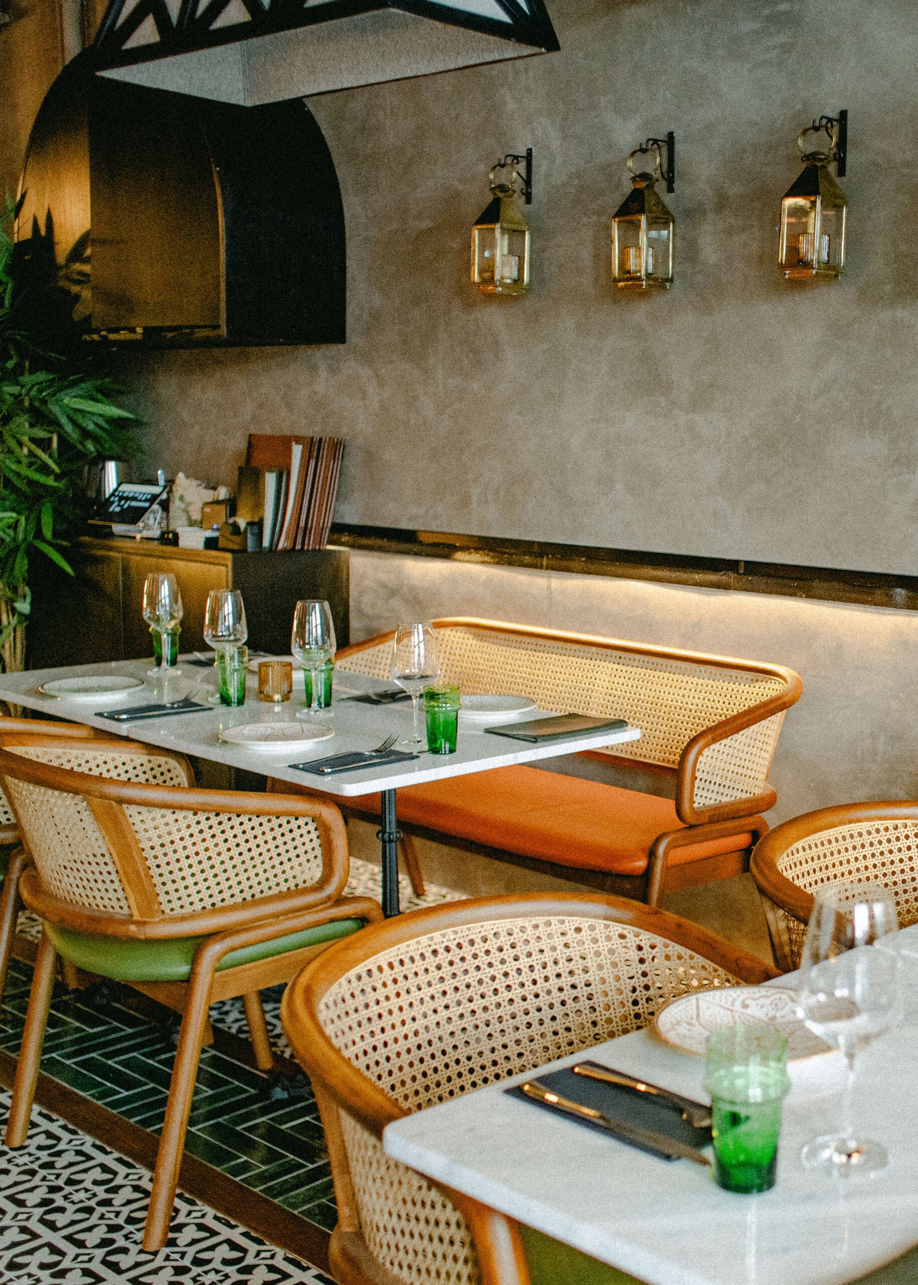
Branding a Modern Moroccan rooted in history
CLIENT
Naema
LOCATION
Singapore
DELIVERY
2024
Project Brief
Naema, a beacon of Moroccan culture nestled in the heart of Singapore’s bustling Keong Saik, approached YMM Agency with a vision to weave the richness of Moroccan tradition with the contemporary dining scene of Singapore.
The goal was not just to be another restaurant but to cultivate an identity that would resonate with their brand values of warmth, family, and heritage. Naema sought a unique branding that would distinguish them in the competitive F&B landscape and make them stand out with authenticity.


Strategy
YMM Agency sought to encapsulate Naema’s soulful essence while appealing to a cosmopolitan audience. This project had a multifaceted scope:
Brand Voice
developing a brand voice that resonates with the Moroccan DNA and familial roots of Naema. YMM Agency aims to distill the warmth of a mother’s kitchen and the convivial spirit of Moroccan culture into a narrative that is both inviting and distinctive. This voice permeates all website content, storytelling, and client interactions to present Naema as a homely culinary experience reminiscent of Moroccan warmth and hospitality.
Visual Identity
From the logo to all the collaterals, the branding is deeply rooted in the authenticity of Moroccan elements, infused with a contemporary breath. Drawing inspiration from traditional Moroccan art and the geometric sophistication prevalent in Moroccan design, we sought patterns and colours that echoed this heritage while presenting it through a modern lens.


Solution
The branding that was crafted for Naema is profoundly inspired by the artistic heritage of Morocco.
Inspiration
We took a special interest in Berber tattoos and Fez embroidery (Terz Fesi), distinctive for their history and intricate beauty native to the spiritual city of Fes. These forms, known for their symbolic expression and precision, were reinterpreted to form the visual language for Naema.
Logo
The logo’s foundation is set with a pointy serif font that offers a contrast to the branding’s overarching softness. We customised tiny elements within the font itself to pay homage to Berber tattoos, incorporating a subtle star symbol as an anchor within the logo.
Colour Palette
Our colour scheme was curated to embody earthy and muted tones, drawing inspiration from Moroccan landscapes, from the reddish hues of clay to the subdued colours found in traditional ceramics and pottery.
Patterns
For the patterns, we took cues from the ornate designs on tajine plates, reimagining them into minimalistic waves and softer strokes that evoke the gentle opacity of watercolour paints as they dry.
Brand Voice
In every touchpoint, Naema’s voice is imbued with the depth of a mother’s love, the welcoming warmth of Moroccan culture, and the generosity of shared meals.


Outcome
Through a harmonious blend of traditional Moroccan motifs and modern design principles, Naema’s vision was brought to life, enabling the brand to stand out with grace and authenticity in Singapore’s competitive market.
The venue successfully launched in May 2024, and has already been creating buzz on the local food and beverage scene.